Design expert Amanda Forrest says the best color for bridging a décor gap between a husband and wife who can’t agree is blue (navy blue, to be precise).
One of the reasons may be because blue is everyone’s favorite. The University of Maryland studied 2,000 people and blue was the preferred color across the board, followed by green (aka blue + yellow) for men and purple (aka blue + red) for women.
Color therapy suggests that blue evokes clarity and increased intuition. We know we can trust and depend on people in blue uniforms. Also said to reduce blood pressure, slow respiration and decrease heart rate, the serenity of blue is commonly used in hospitals and health centers to promote relaxation and healing for body and mind. Its calming effect rejuvenates us on the home front too, which is why blue reigns in bedrooms and family rooms.
As comforting as blue can be, the moodier side of its personality can leave us feeling, well, blue. Certain shades can come off as icy and aloof or cause sadness, loneliness and even loss of appetite.
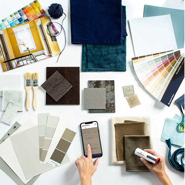
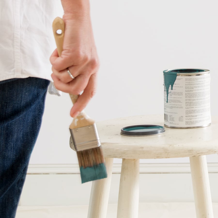
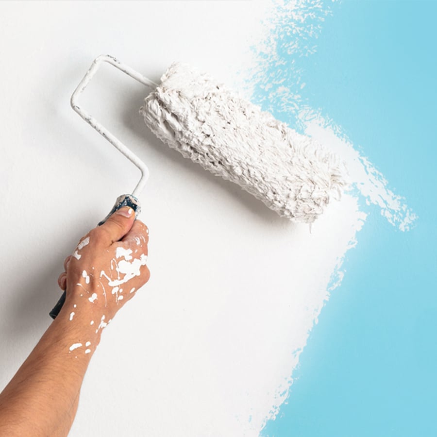
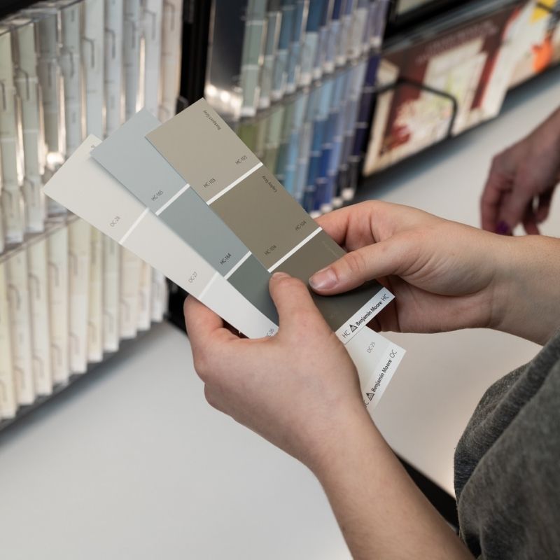
If you want to play with a blue palette that won’t leave you feeling frosty, here are some tips:
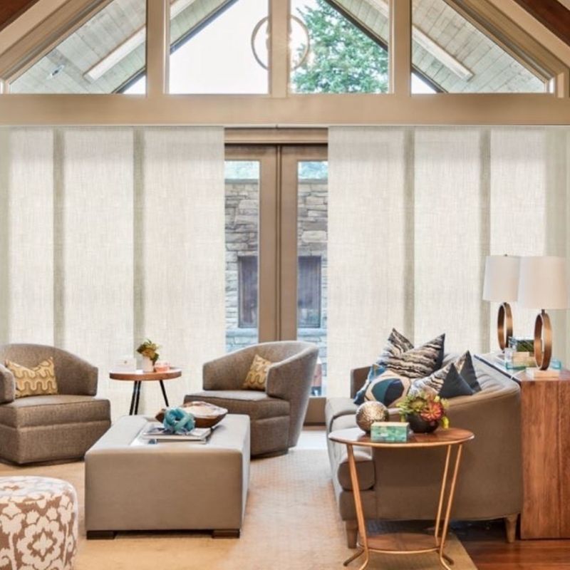
In a room that receives little natural light, a cool blue can turn unseasonably chilly. Blue tones that inspire more warmth include those with slightly more yellow or green undertones like turquoise, robin’s egg and cerulean.
To create a cozier feel in a blue room, pair it with warm woods, natural fibers and accents bursting with reds, oranges or yellows. The blue will soften the bold while the more intense colors add needed spice and sizzle to the mix.
By emulating the beauty of sea and sky, the classic combination of blue and white anchors waves of coastal chic. Think nautical striped wallpaper, embroidered throw pillows and summery patterned drapery to bring the outdoors inside.
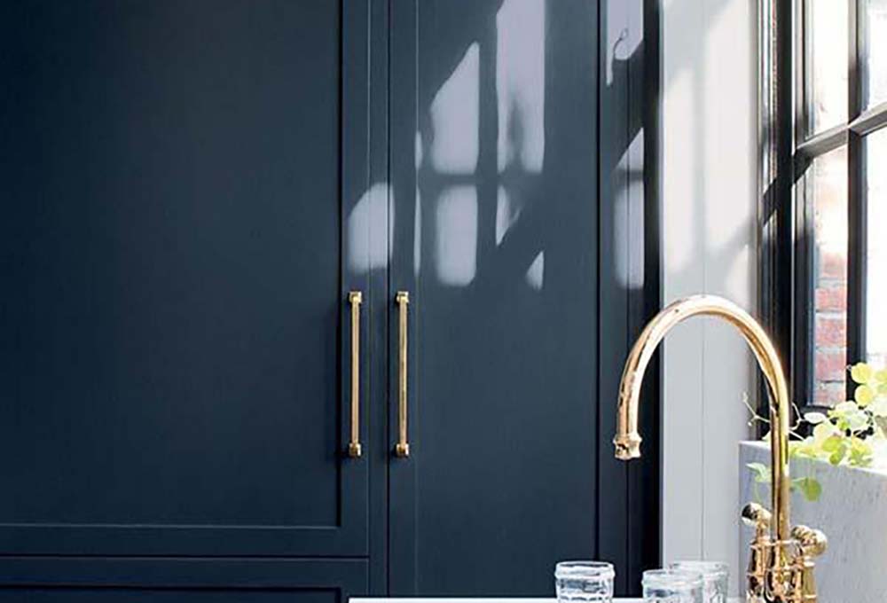
Timeless blue is the ideal choice when investing in furniture as a featured focal point. A blue sofa, for instance, will make an impact with color, stand the test of time, and can be used as a design springboard for adding lighter and darker shades of blue accents.
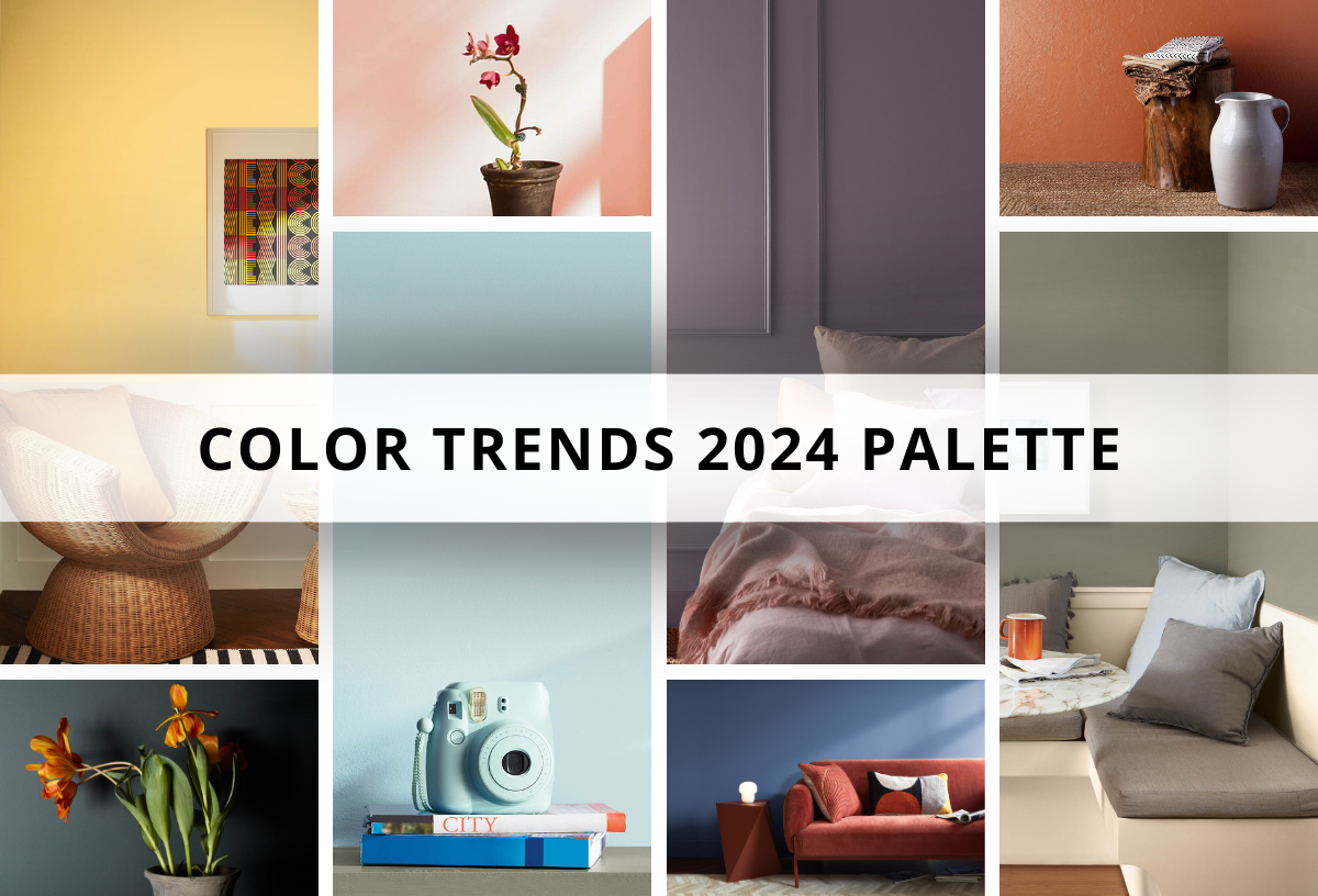
Disclaimer: There are no bad colors, only poor design choices. Many of the moods and reactions associated with certain colors are directly linked to past personal experiences and influences. Side effects may include relying too much on favorite or “safe” shades and the inability to try different hues. We firmly believe that every color has uniquely positive traits and, when used as directed by a professional, the potential to inspire and elevate really great living spaces. Ask our design team for details.